
And so we have come near to the end of our journey.
This is part five and the conclusion of my series of posts on the fantastic, lovely, delicate, ambient, bold and beautiful world of shading.
Over the past couple months we’ve talked about the tools of the trade, explored a rather painterly method of drawing with charcoal, and a very refined way of drawing with graphite, and we’ve discussed the messy process of finger blending. We’ve created lots of new art (y’all have been doing your homework, right? …right? Oh shoot, have I been forgetting to give homework?? *makes mental note to give homework*), and learned lots of new things along the way (like don’t ever try to draw blurry Glen Campbell again).
Today, I’d like to kick back a little bit, and show you a really fun, stylized way to create a portrait. Our main focus this time will be on lines and shapes, and how to use them to create interest in your shading.
Let’s just get right into it, shall we?
Materials
I’m using plain ol’ Premium Card Stock for this drawing. I like sketching on card stock, maybe because I grew up drawing on printer paper, and the texture is very similar, although much more durable. Plus I’ve found drawing with cheaper materials helps you break through the idea of perfectionism and just have fun.
My tools this time around are limited to various pencils and erasers. No blending tools this time.
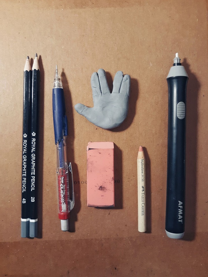
2B and 4B drawing pencils, 0.5mm mechanical pencil filled with 2B lead, kneaded eraser, block eraser, pencil eraser, and electric eraser (which I actually only used very briefly for some touching up).
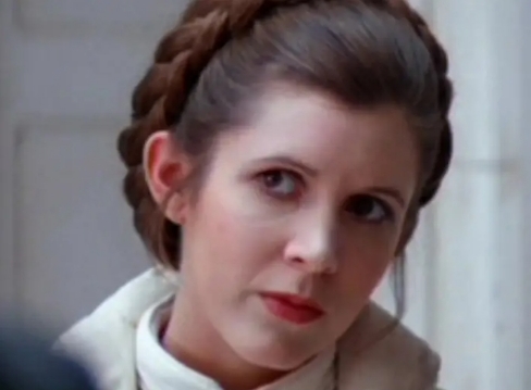
And of course, a reference picture.
The Process
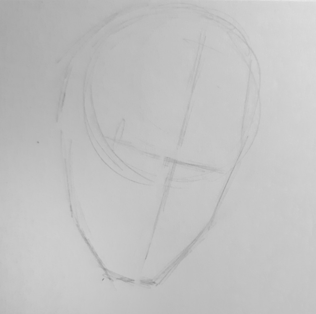
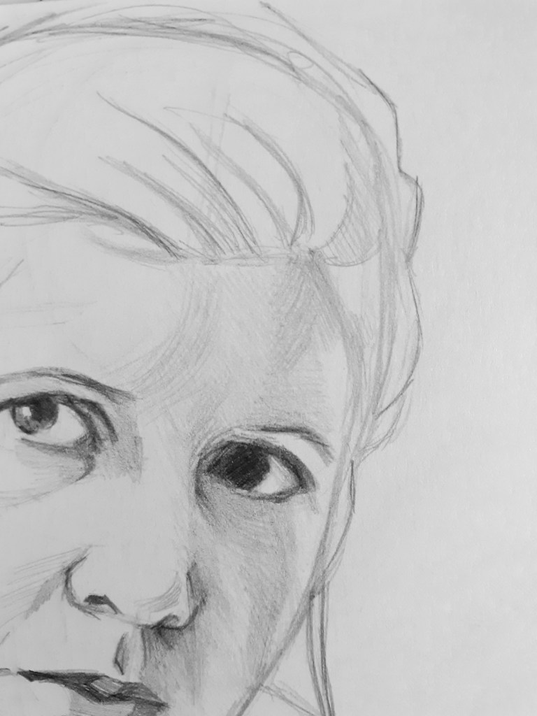
I start sketching with my 2B drawing pencil. I’ve found the mechanical pencil is a little too “clean” and precise for my preference. At least in this initial sketching stage. I’ll definitely be using the mechanical pencil later.
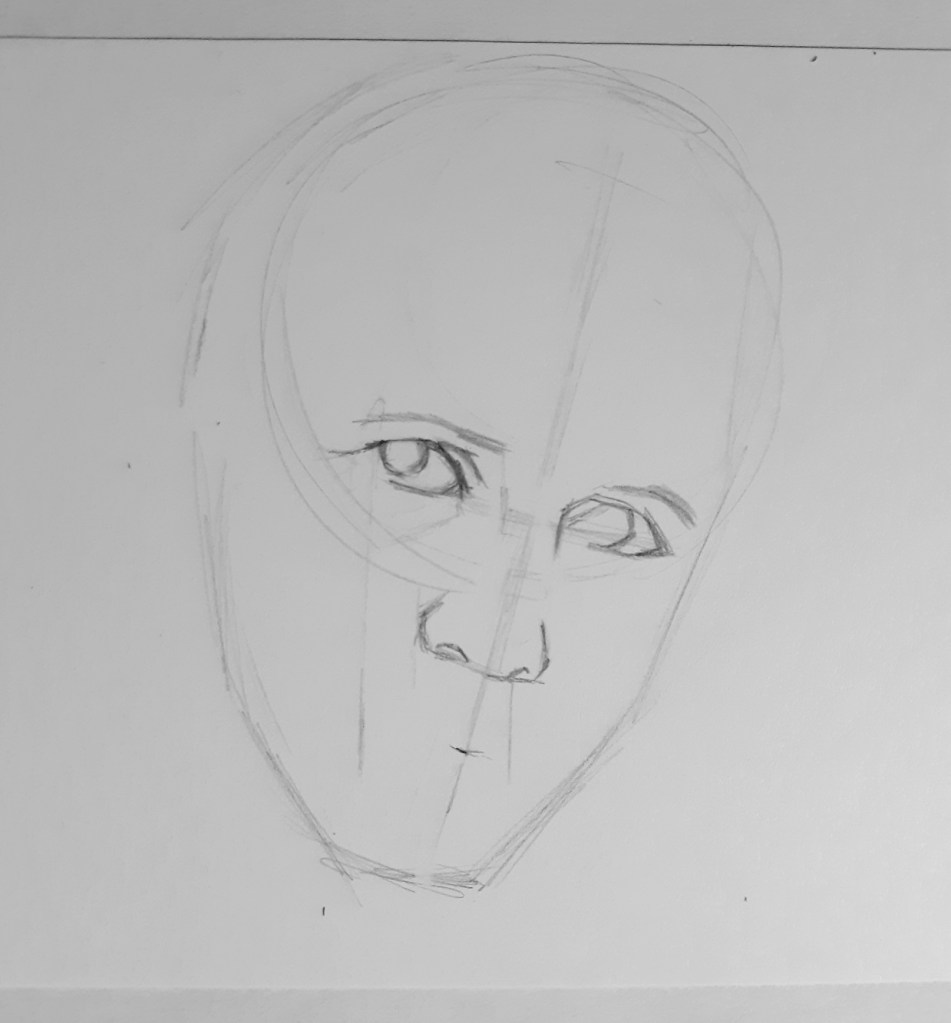
I begin sketching in the features, using a lot of angled lines to comprise the “curves” of the eyes and nose. This is mostly a stylistic choice on my part. But drawing curves as a series of straight lines and angles also helps me draw curves correctly, and not exaggerate them too much.
Of course, there is also a time and place for exaggerating curves. We’ll get to that in a moment.
The rest of the portrait is blocked in very simply, with just enough information to let me know whether or not I’ve created an accurate likeness. All the details will be filled in once I start shading.
And speaking of shading, let us begin!
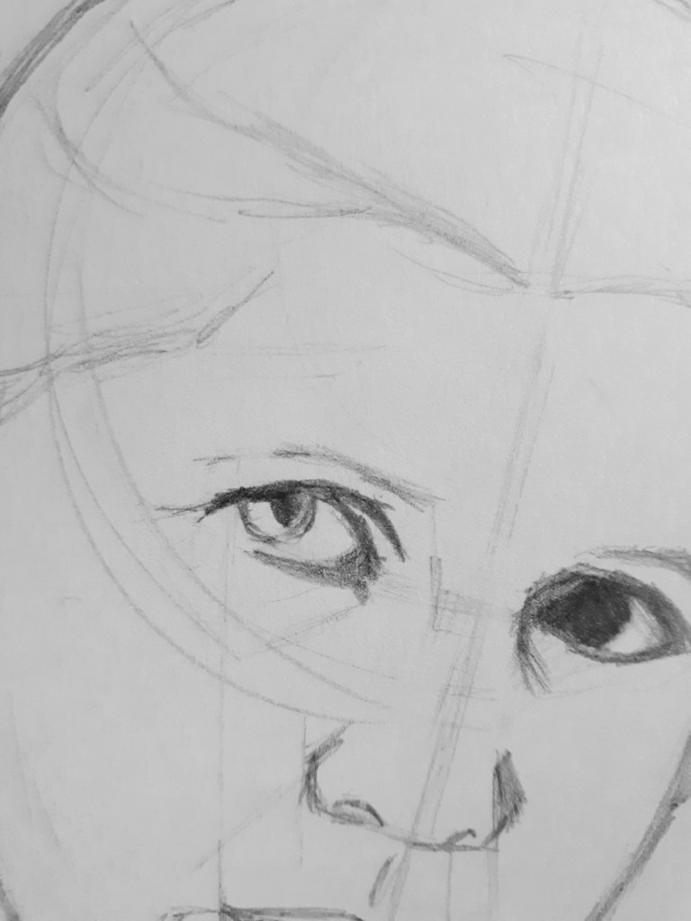
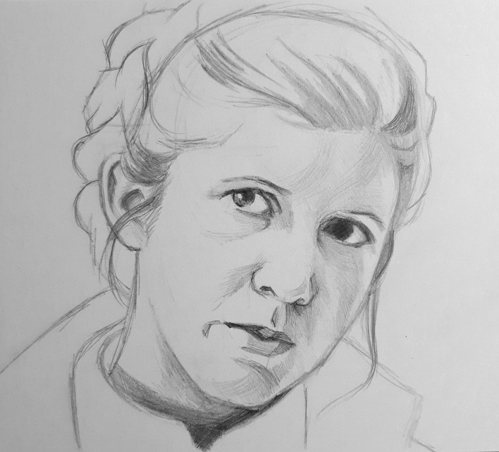
I’m keeping everything as simple as I can, and trying to see the shading as blocks of tone, and interesting shapes.
For example, I took all the different dark tones that create the shape of her eye and converged them all into one rather simple, yet interesting and readable shape.
There are definitely areas that make this merging of shapes easier, and areas where you need more detail, so don’t try to force it. Otherwise you might end up suffering from TMLES… which of course stands for Too Many Lost Edges Syndrome. (Which is fine, I suppose, if you want to go more impressionistic, so I won’t completely discourage it. After all, the rules are there for the breaking).

I also simplified the shading around her nose into these little blocks of tone.
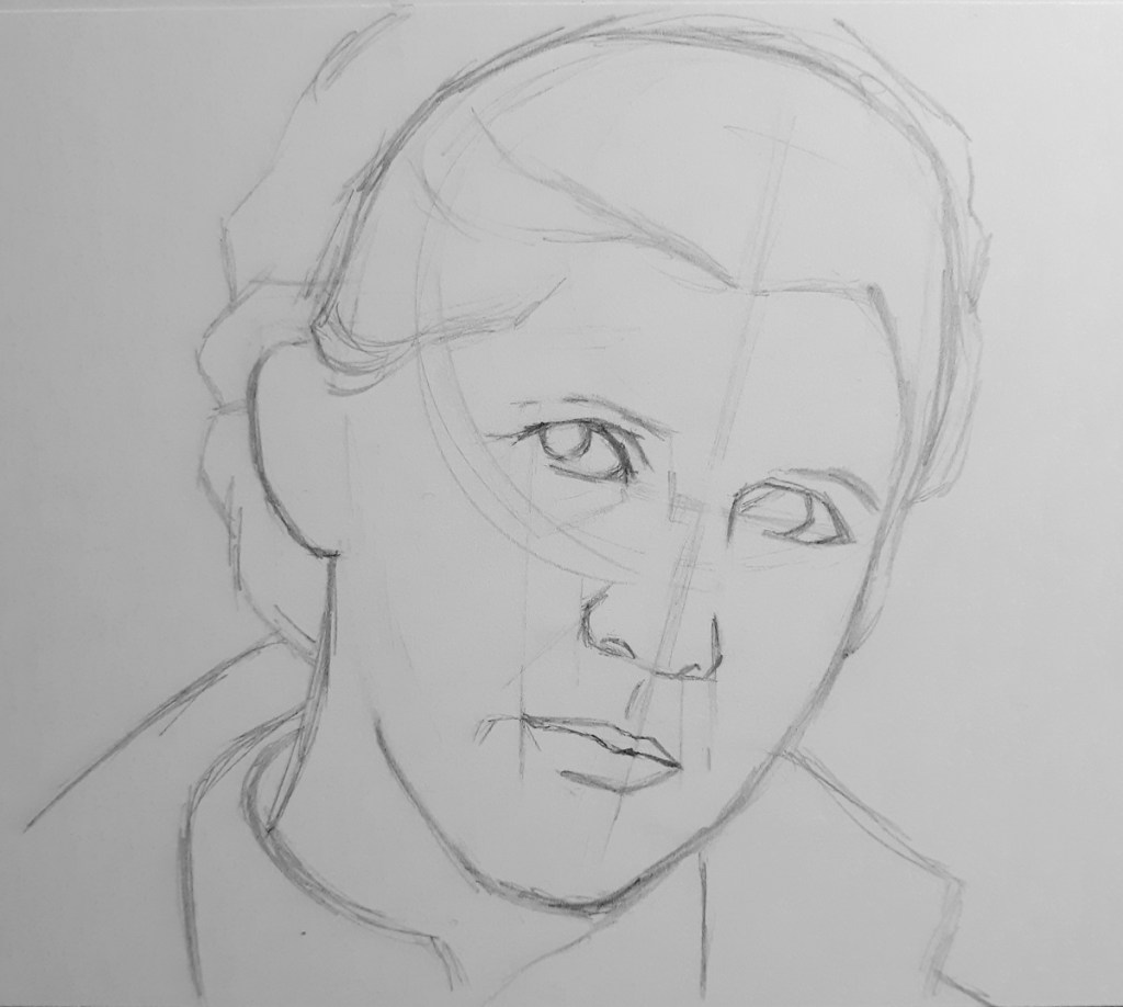
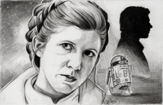
Here I’m cleaning up the silhouette/shape of her hair, and also adding the shadows on the darker side of her face. I’m trying to keep this softer and more curved, since this is a woman’s face. If you’re drawing a male, on the other hand, I would say, yes, go all out with those rough lines and angles (which is totally what I did in my Han Solo drawing a while back).
I’m using a sort of light hatching technique to create the shading. It’s not exactly cross hatching, but something to that effect. I do some straight line hatching to create a base tone, and then go back over it with some curved hatching to create the shape of the face, and then continue building up the tones from there.
I also added some sharp lines with the mechanical pencil around some of the shadow areas to give them more definition and contrast.
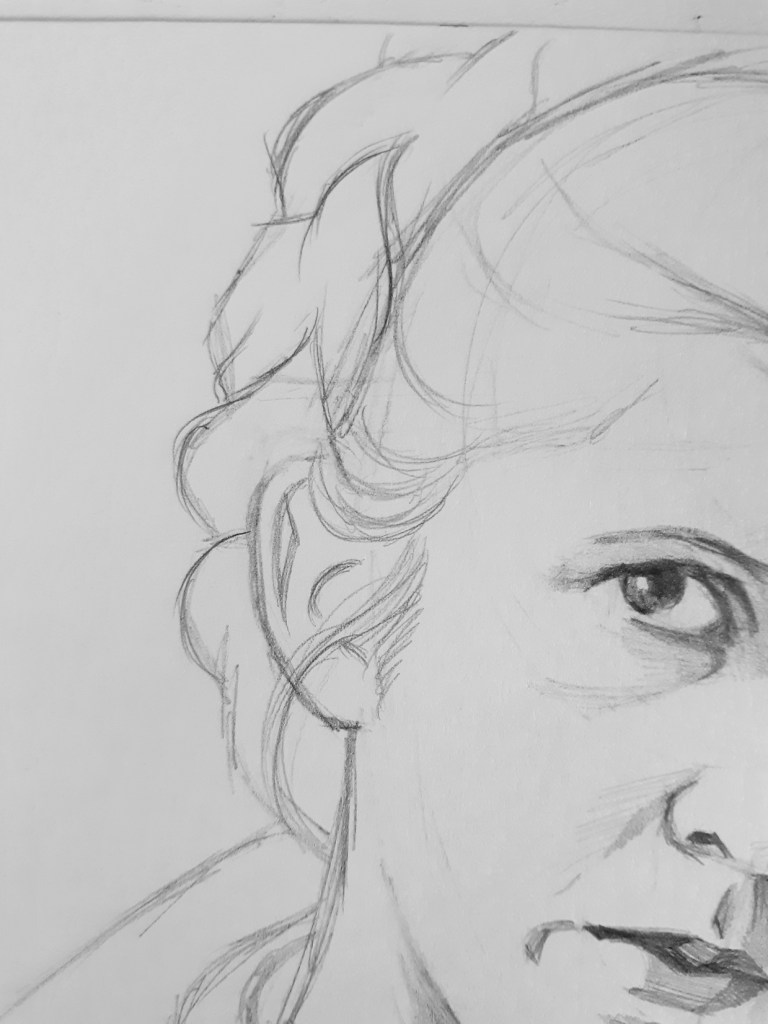
Now I begin working more on the hair, refining my outline a bit. And here’s where you can really go crazy with your curved lines if you want, and play around with those C and S curves.
I always have fun with the hair in these sketches. I guess since hair is naturally more versatile, it gives you more freedom to stylize without worrying about messing up the likeness.
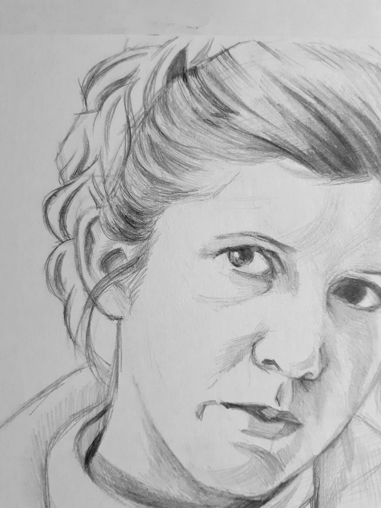
Now I’m adding more dark, curved shapes to suggest the direction and separate strands of hair in her braid.
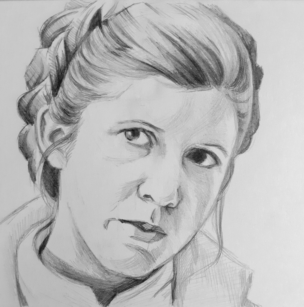
Then I fill in the shapes with some gradient shading, which I can see in the reference. And lastly, I go over it with my mechanical pencil. Since the lead in my mechanical pencil is sharper, it’s able to fill in more of the tooth of the paper, and create darker tones.
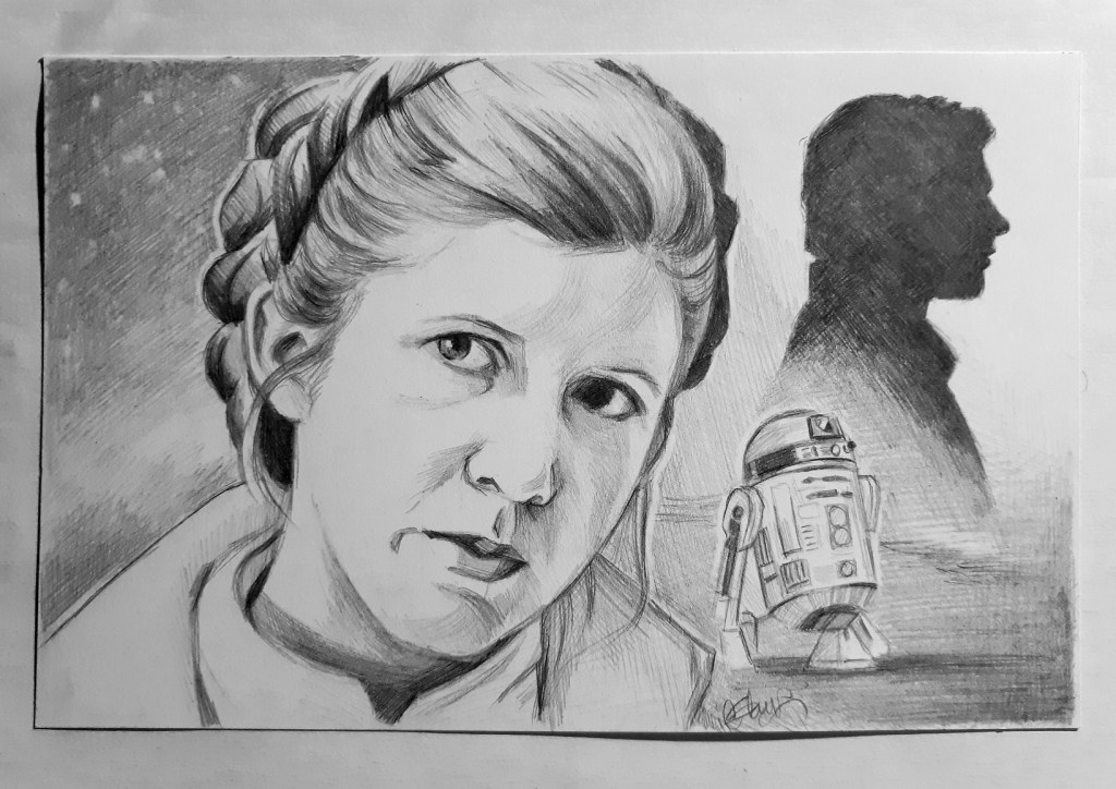
At this point I’m mostly finished with my drawing, and I’m left to decide what I want to do with the background. I thought about leaving it blank, or writing a quote or something. But in the end, I knew what I had to do.
I had to make it match my Han Solo drawing.
So I went and found a couple more reference pictures.

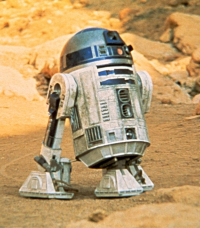
Han Solo because of obvious reasons, and R2-D2 because he was with her at the beginning of A New Hope.
I ended up reversing the image of Han Solo. And I gotta tell you, it took me forever to get the silhouette to look right. (This is where I used the electric eraser.)
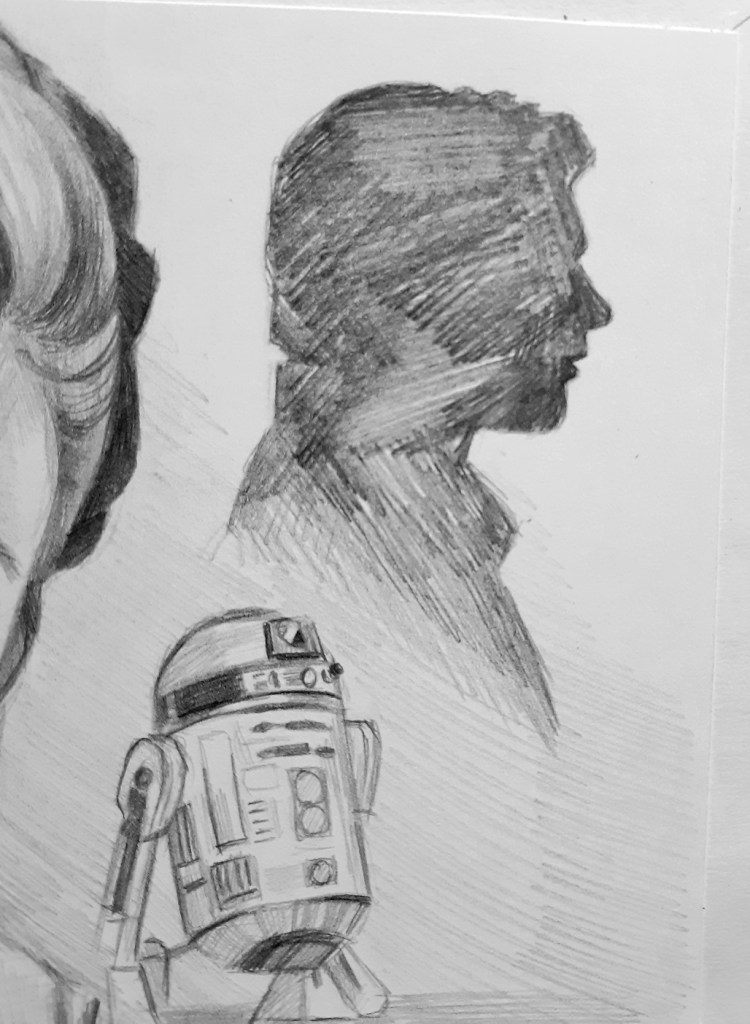
Laying down the base layer of shading with my 2B drawing pencil. I’m afraid I don’t have a lot of rhyme or reason for the direction of my strokes in these early phases.
Then I went over the silhouette several times with the mechanical pencil, to get it really dark. (And okay, I did “cheat” here a little bit, and used a small blending stump to smooth out the tone a little. But only for the really dark area, where you couldn’t really see it.)
I also added more shading around the edges of the drawing, and then created a thin white outline with my kneaded eraser, like I did in the Han Solo one. Once again, this is just a style choice.
On the other side of her head, I just did some gradient shading, and then put some stars in the top corner. Then later, because I didn’t like how blank that side looked, I ended up adding a little sun flare for more interest.
And after a few more touch ups, I scan it into the computer, and call it finished!
Now I guess I just need to do one of Luke in this style, to complete the series. (Yep, I already got the whole collage planned out. 😛)
Closing Thoughts
I know I said this in my first post of the series, but I’ve been thinking about it more, and the shading—with all its form, its deep shadows, and white highlights, and and its subtle gradients and hints of texture, and all the stylistic choices— the shading really is where the art happens.
I thought about this especially with this drawing, because shortly after I started it, I realized… I don’t really like Princess Leia. She’s just not my favorite.
You know, most of the time when I create fan art, it’s because—in a way—I believe in the character. Or maybe more specifically, I believe in the truths and values that they represent. Heroism, Bravery, Sacrifice, Forgiveness, Love, etc.
And I don’t know, I just don’t really believe in Princess Leia like that (sorry).
You can run into this problem too, when you do commission work. It’s easy to draw someone you know and love, and really pour your heart into your work, because you care about that person. But when someone gives you a picture of someone you don’t know, or an idea you don’t really connect with… how do you pour your heart into that?
Well, here is something I learned with Princess Leia once I began the process of giving my lifeless outline its form and shape… You can believe in the beauty of art. You can believe in doing good work. You can believe in finding joy in the mundane, and pursuing excellence even when you don’t feel like it.
And that, my friends, is where I believe the art really happens.
So. Your homework this week is to grab a cheap sheet of paper (or whatever you have handy), start a timer for twenty minutes. And in those twenty minutes, I want you to make something happen. Find a picture of someone you love. Find a picture of someone you don’t. And create something you can believe in.
I know I make that sound really easy. It’s not. Use your eraser. Fix your mistakes. Don’t start over. Keep going until you’re satisfied. Or until the timer goes off. And when it goes off, you can decide whether you want to keep going or not, but I’m just asking you to take twenty minutes.
Be courageous. Be bold. Don’t worry about what other people will think. You probably have more artistic ability in you than you might think. Don’t hold it back, homie.
Alright, folks. I’ll be back next week, and you better have done your homework. *points threateningly, because I don’t actually have any threats to use*
Until then, stay lionhearted.
~Chalice

This is absolutely stunning. I’d never guess you didn’t rate her much, I’m not sure I could do her this much justice and I love her. Well actually, I love the actress rather than Leia herself.
LikeLiked by 1 person
Thank you so much! And yes, it’s not so much that I don’t like Leia, as she’s just not my *favorite*. 😛
LikeLiked by 1 person
Chalice, this is so good! Your encouraging words at the end are so inspiring and uplifting. ❤ Thank you for this post series.
LikeLiked by 1 person
Aww, thank you so much, Kyndal! And thanks for sticking with me throughout the series. 😉 I’m glad you found it inspiring! 💛
LikeLiked by 1 person
Rey is actually my favorite Star Wars heroine *gasp* I know, I know. I like Leia, but I feel Rey comes first for me Lol.
Either way, that is a stunning drawing of Leia! And I love how you added in Hans and R2-D2!
Thanks so much for sharing your tips, advice, and encouragement in this series!
P.S Who is your favorite Star Wars heroine?
LikeLiked by 2 people
*le gasp* How scandalous! 😜 No, I can see how you would like Rey more. (Although, I’m definitely very loyal to the originals, haha!)
Thank you, Lily! I’m glad you enjoyed the series! Your comments are always very encouraging. 🤗
Hmm… My favorite Star Wars heroine would probably be Jyn Erso. Or Ahsoka…
LikeLiked by 2 people
Lol, oh Jyn was a good one! And is it scandalous to love both the originals and the sequels? *hears more gasping*
Aww, thanks! I really enjoy talking with you 🙂
LikeLiked by 1 person