

Hey guys! I just realized it’s been about two months since I’ve posted anything. Well, things have been kind of crazy over here…. Crazier than normal. My family has the chicken pox. Whoop whoop! So, this post is going to be a little bit shorter than usual.
Anyway, let’s jump in.
Here’s a drawing I recently did of Sophie Scholl.

…And I’m trying not to cringe. There’s a lot to fix here, but the main problem is lack of contrast. It makes the whole drawing look washed out. So let’s look at a couple ways to fix this.
1. Use 2B Lead
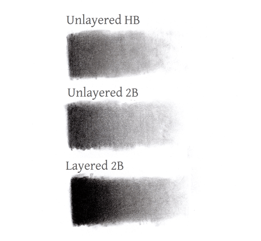
One of the mistakes I made in this drawing was only using HB (hard black) lead. Now don’t get me wrong, using HB is not bad. In fact, I use it quite a bit for lighter details and shading. But when you’re trying to fill in dark shapes like this, HB is just a little too hard. Instead, try using 2B or something blacker.
There’s a full range of tones from black to white, and HB can’t really capture the darker part of those tones. So the problem that comes up when you try drawing with only HB is that you don’t have all your tones and that causes you to lose a lot of detail in your drawing.
2. Layer, Layer, Layer!
The second big mistake I made is that I did very little layering. I filled in my shapes once and blended out my strokes with a blending stump and didn’t continue building up my tones. This makes for blotchy and uneven shading. So just keep layering and blending, layering and blending. This will make your shading darker and smoother looking.
Here are some gradients I drew. There’s a small difference between 1 and 2, but as you can see, layering is what made the biggest difference.
And here’s the before and after of my drawing with these tips applied. I also did a little extra work on her face to make it look more like her.


Ah, that looks so much better! I feel like I can breathe now.
Well, That’s all I got for you today. I hope you found this helpful. What tips or tricks do you use to add contrast to your drawings? Let me know in the comments!
Until next time!

Oh my goodness, I hope your family recovers super soon 😱
These are some SUPER great tips!! And your drawing looks AMAZING!
LikeLike
Thank you, me too. XD
Thank you!!
LikeLiked by 1 person
Ahhh I work in pencil a lot, so great to know! 😀
LikeLike
I love working in pencil! I’m glad you found this helpful!
LikeLike
Oh wow! That is so neat. I will have to try this… Thanks for such a helpful post Chalice!
I hope your family begins to feel better!
LikeLike
You’re very welcome!!
And thank you so much! 🙂 Those of us who had it bad are feeling much better now.
LikeLike