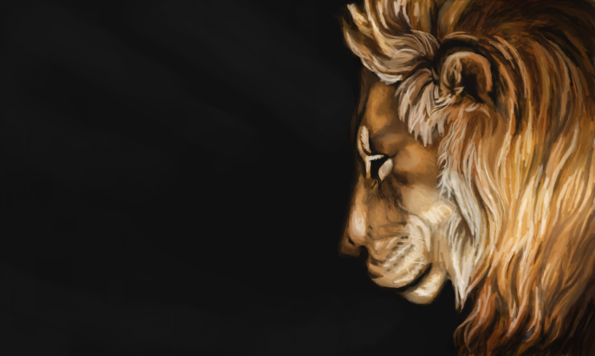

Hey Lionhearts! Welcome to the third installment of a series of posts on the technicalities of advanced pencil shading. (In case you missed them, you can check out part 1 and part 2 here.)
Today we’ll be talking about graphite, which is still one of my favorite mediums to work with. It’s very versatile, and easy to work with, and I realized recently it’s actually a very delicate medium. At least in the technique we’ll be covering today.
While charcoal is all scrubbing, and erasing, and getting your hands messy, graphite feels more refined, and polished. But that’s not to say you can’t have fun with it and create beautiful art.
But before we jump in and start creating that beautiful art, I would like to give you five quick tips on using graphite and blending with stumps. These are just some things I’ve learned over the years. And this first one is probably the most important.
1. Layer, layer, layer!
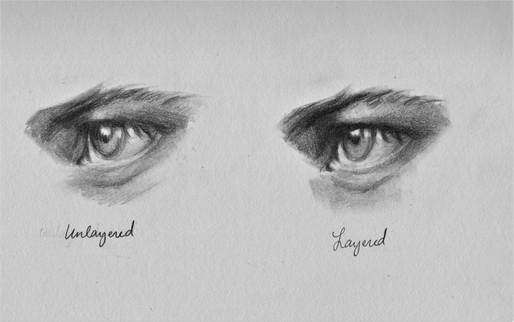
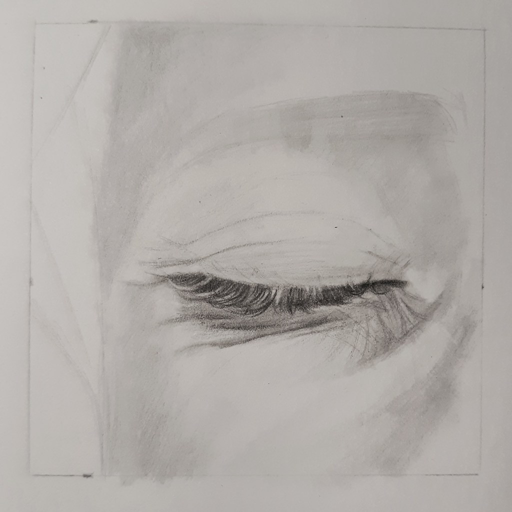
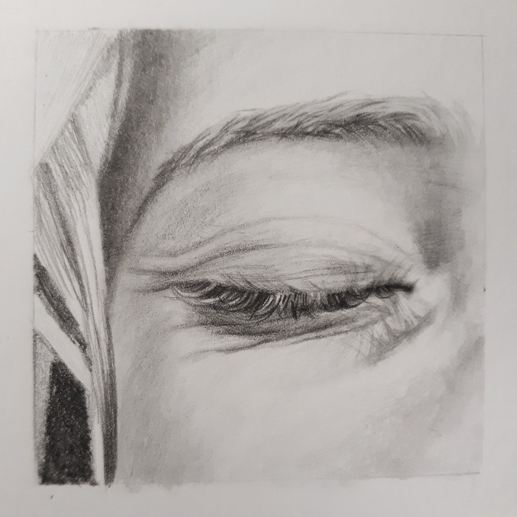
Here’s a quick eye study I did with a 2B pencil. On the left side I put down my graphite tones, blended them out, and then used an eraser to lift out the highlights. I thought it looked pretty good. (I was actually worried that it would look better than my layered version, which didn’t look so good at first. 😆)
Then on the right side I did the same thing. Only after I was “finished” I went back over it with the pencil, strengthening my dark areas, correcting the shape a bit, and evening out my tones.
As you can see, layering is extremely key in creating contrast, a smooth tone, and really dark darks. And while I was able to create something that looks alright without it, It really pays to take that extra mile in your art. Don’t neglect layering folks.
2. Blend delicately
Alright, alright. So I’ve completely changed my ways. You can totally use the tip of your blending stump. Why did I always think this was such a bad thing?? I think I’m having a crisis now…
Okay, but the important thing is that you blend delicately. I know when I first started using tortillons and stumps, they felt like the magic blending tool, and I didn’t really use them with care (other than solely using the side of the tool, so that I wouldn’t crush the point). I just kind of rubbed them haphazardly over my drawing, and had very little technique.
But let me tell you a little secret: you need to blend with just as much care as you draw. And if that means you need to use the tip, then use the tip. And don’t listen to amateurs like smart-aleck-past-me, who thought she knew it all.
If you’re struggling with muddy, streaky blending, it’s probably because you’re using too much pressure. This goes for any blending tool, whether it’s a stump, or a Q-tip, or your fingertip. Graphite actually blends out pretty easily, so don’t be afraid to lighten up on the pressure a little.
Another thing that might be causing muddiness, is using dirty stumps. Thankfully, you can “clean” them by rubbing the side onto a clean piece of paper, until little to no streaks show up. It will still look a little dirty, but that should get most of the excess graphite off.
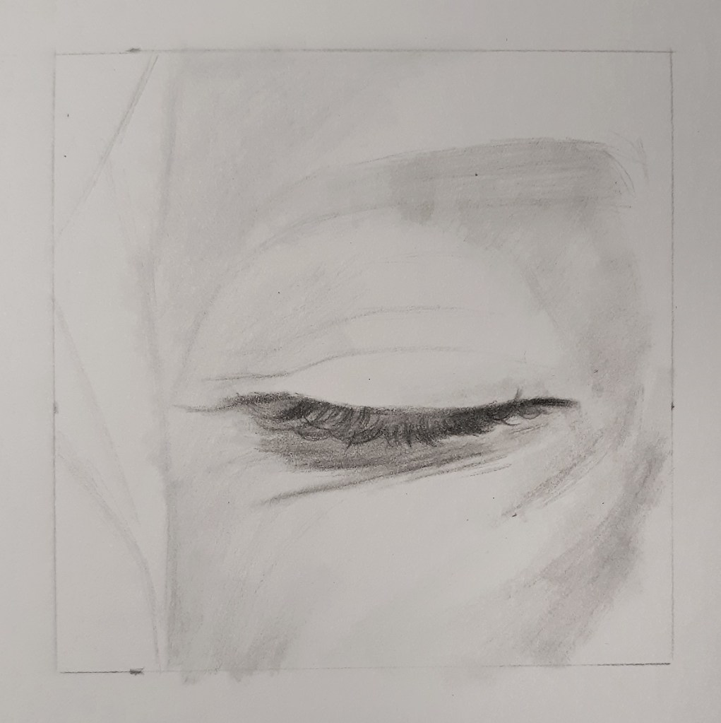
3. Use the eraser
I feel like the eraser is a rather underrated tool. Most people think that it’s only good for fixing mistakes. But my dear friend… it is so much more than that.
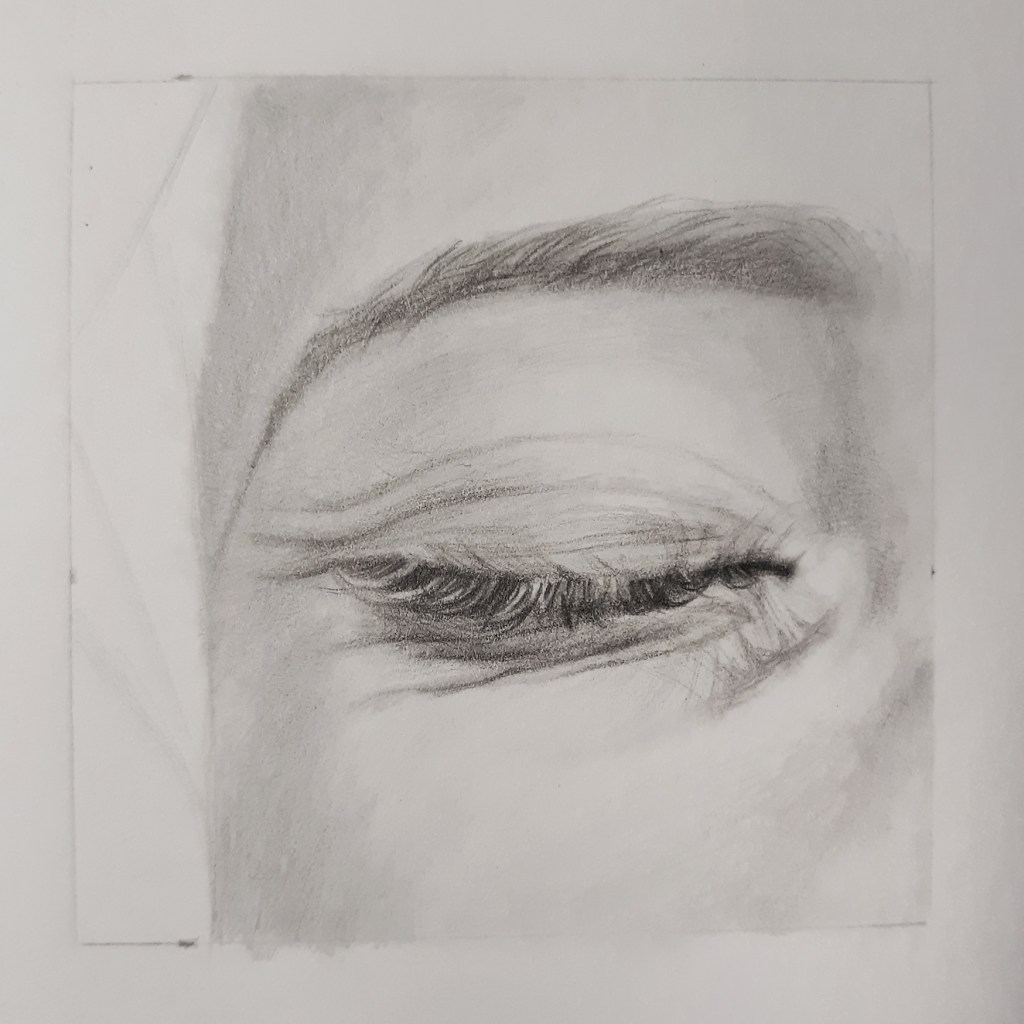
To show you what I mean, here’s another eye study.
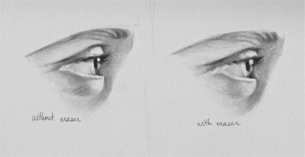
Once again, on the left side I drew the whole thing with minimal use of my eraser. I drew around all of the highlights and had to be really careful not to get my tones too dark. On the right, I used my kneaded eraser as I usually would (in other words, pretty much everywhere). To lift out highlights, and touch up graphite blotches, and put in light details that would take way too much time to try and draw around.
It’s not a HUGE difference, but as you can see, using the eraser gives the drawing texture, creates a more painterly feel, and helps you avoid the cut-out look that appears when you draw around your highlights.
I don’t know where I would be without my eraser. It just makes the whole drawing process so much quicker and easier.
4. Work with a range of pencils
Let’s talk about pencils for a bit. In short, you need the black ones.
2B, 4B, 6B, 8B.
I went for a long time only using HB. And then I learned the difference between HB and 2B and went a long time using only those. And then I realized that 2B wasn’t actually that black, so I started using all the others too.
And even though I was excited about learning more and progressing in my art, I realized I still needed HB just as much. I still use it all the time for light skin tones, and blending/smoothing out the blacker pencils, and drawing fine hairs.
So definitely use the black pencils, But also, don’t neglect the hard ones. You really need the whole range to reach the full potential of a pencil drawing.
5. Double check your tones
At last, you’ve come to the end of your drawing. You’ve just placed those last lovely details, and you’re ready to sign it, and be done.
At this point in the drawing, I like to take some time to go back and double check my tones, and make sure they’re all as accurate as I can get them to the reference photo. Are my blacks dark enough? My whites light enough? Is everything the correct tone?
I know I’ve said this before, but it bears repeating: it’s REALLY easy to get lost in the details. I’ll be going along in a drawing, “okay, that’s dark, that’s light…” But I’m not really paying attention to just how dark or light the reference is. So after I’ve finished putting in all the details I like to go back and double check my tones, glazing over midtones with the HB or darkening shadows with the blacker pencils.
This step is actually really relaxing, because you already have all the details down, so it’s just about going around and making sure your drawing looks as good as it can. 😊
Alright, so those are my Big 5 tips for creating a realistic graphite drawing. Now let’s take a look at what all this looks like in practice!
A Wee Demonstration
I’m working on Bristol’s SMOOTH surface paper this time (not to be confused with Bristol’s vellum paper). I like this paper because the smooth surface allows you to capture really fine, sharp details. But it also has enough tooth to hold several heavy layers of graphite.
The tools we’ll be working with:
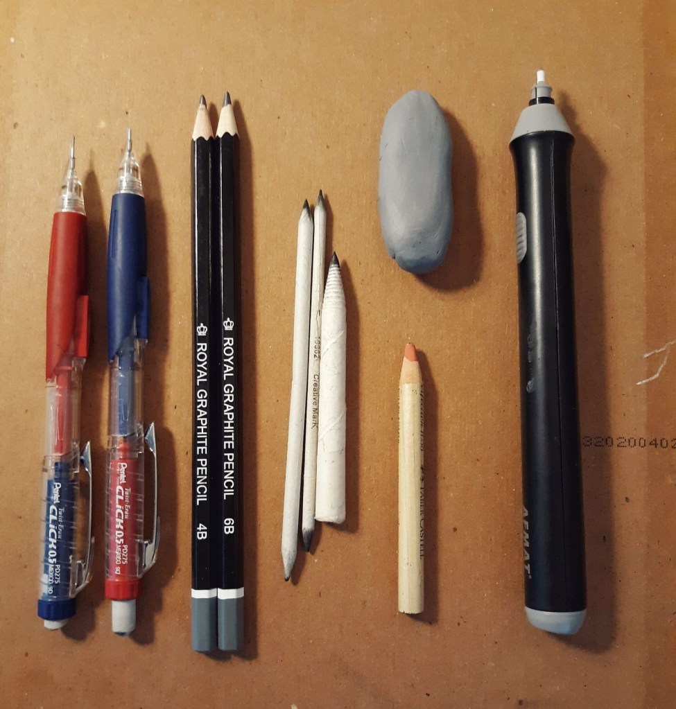
Mechanical pencils filled with HB and 2B lead; 4B and 6B pencils; Blending stumps/tortillon (I like to use these smaller ones, because I’ve found they work better for the more detailed work); My Faber-Castell kneaded eraser and pencil eraser; and last but not least, my AFMAT electric eraser.
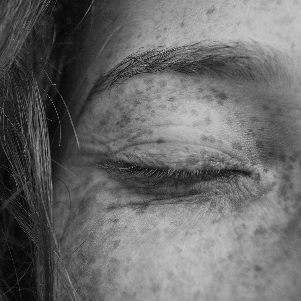
And a reference picture from Unsplash.
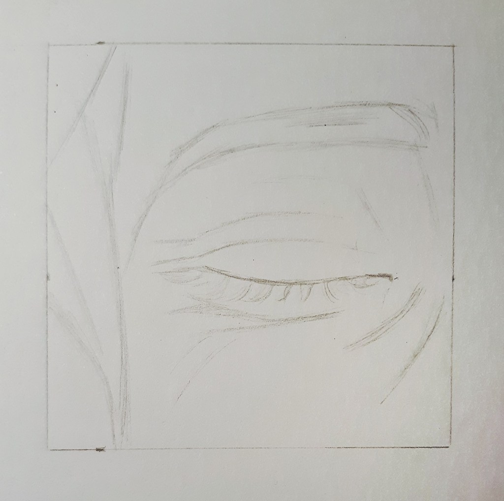
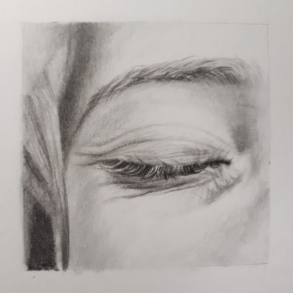
The first thing I do is put down a sketch with my HB pencil.
With a really detailed picture like this, it’s sometimes hard to know where to start. So, I squinted my eyes (oldest trick in the book) so I could break it down to just the basic shapes. And then I drew that in with my trusty 2B mechanical pencil.
Then with the HB pencil I continued to block in the basic shading of the face, and then blended it out with a stump. At this point, it will look a little rough, and that’s okay.
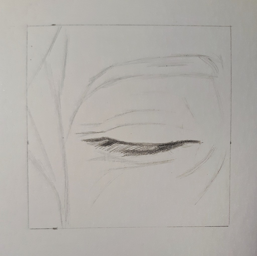
From here, I start blocking in the details of the eyelashes, and the wrinkles under the eye with 2B. Some people find eyelashes difficult to draw, and I admit, they’re a bit of a challenge. Something that helps break them down, is trying to see them as an abstract shape that you’re trying to replicate, rather than seeing them as individual hairs that you need to draw separately.
I used my pencil eraser to lift out the highlights in the eyelashes, and continued to work around the area of the eye. I used hatching and cross hatching techniques to create the texture of the crinkled skin.
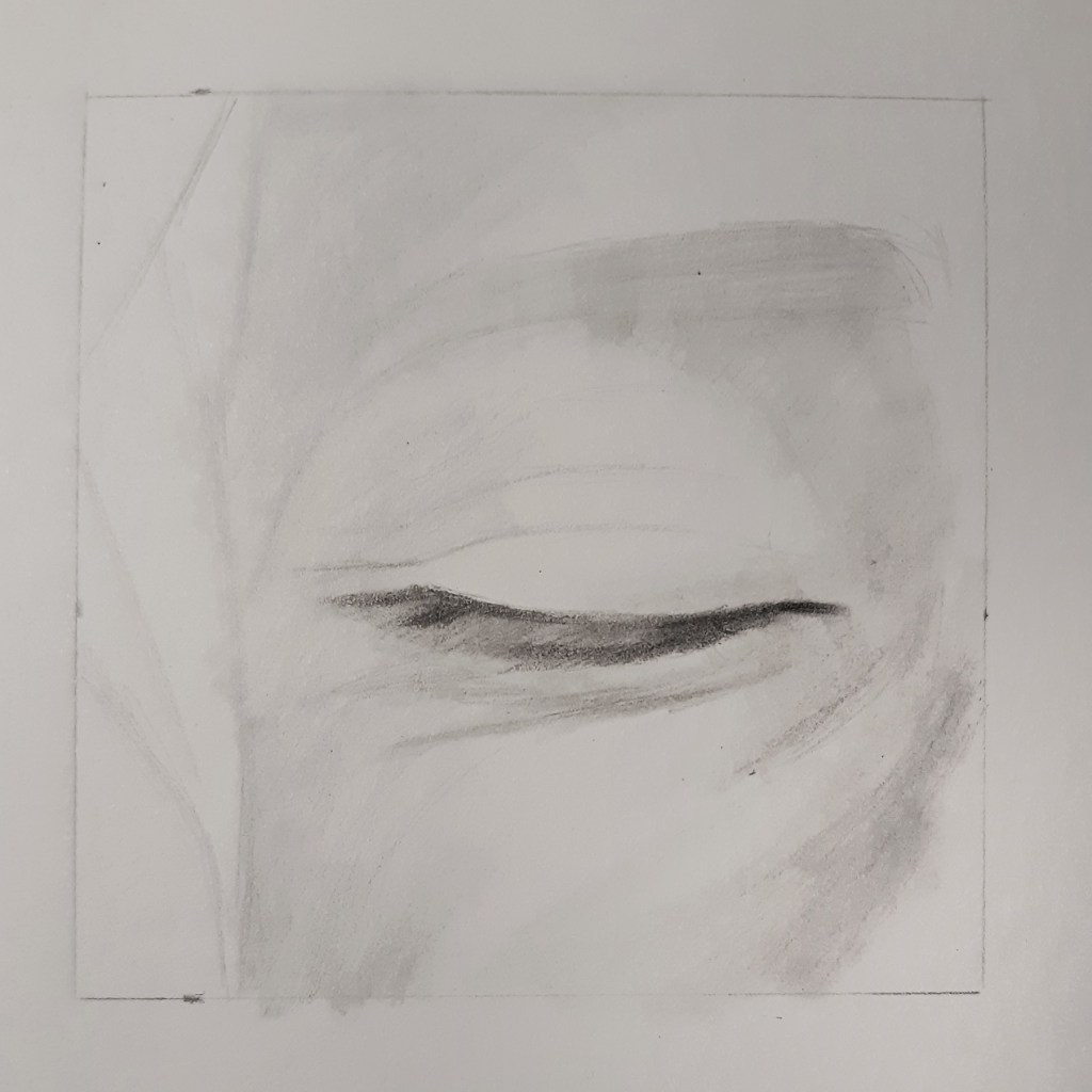
Then I rotated working with my pencils, stumps, and kneaded eraser to darken and tidy up the shading around the eye. You can see in the first picture, I accidently got a fingerprint right in the middle of the eyebrow. So I used my kneaded eraser and a sort of dabbing motion to lift that out.
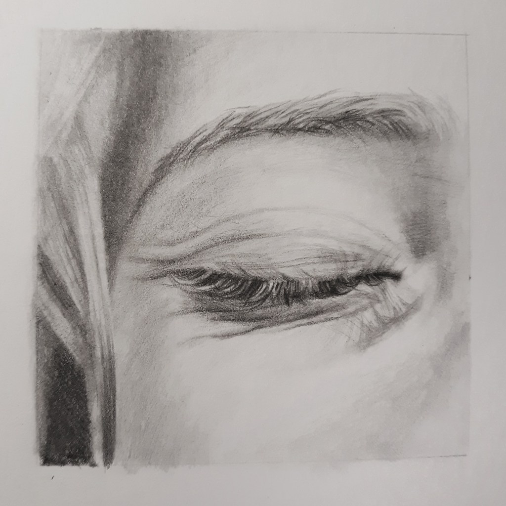
Now let’s work on the eyebrow. And I thought I should add that I use the same method/steps no matter what kind of hair I’m drawing. Whether it’s a blond eyebrow, or long, dark, curly hair. It’s all the same technique. I start out by blocking in the basic shading, and then blending it out.
Then on top of that I put in the hair with my pencils. I’m not trying to place each hair perfectly like it is in the reference, I’m just trying to copy the shapes I see, and the basic direction of the hair. Then I blend that out, careful to follow the same direction with my stump.
I erase the highlights next, using my kneaded eraser and my pencil eraser.
And from there, I continue to build up the layers—drawing in the hair, softening my strokes with a stump, and lifting out the highlights—until I’m satisfied with how it looks. I also added some darker shading on the forehead with my 2B and 4B pencils
Now we’ll follow those same steps for the longer hair around the face. Begin by blocking in the basic shape and the direction of the hair. I used 4B and 6B for the especially dark areas.
Blend it all out with your stump. The hair is pretty dark, and will require lots of layering, so I’m not too worried about it looking messy here.
Next, I use the pencil eraser to pull out the highlights. Again, with the pencil eraser I’m not trying to draw each individual light hair. I’m just following the general shape and direction.
And then I go over it again with my pencils, using the 6B, 4B, and 2B for the really dark shading, and the HB pencil to draw in the finer dark hair.
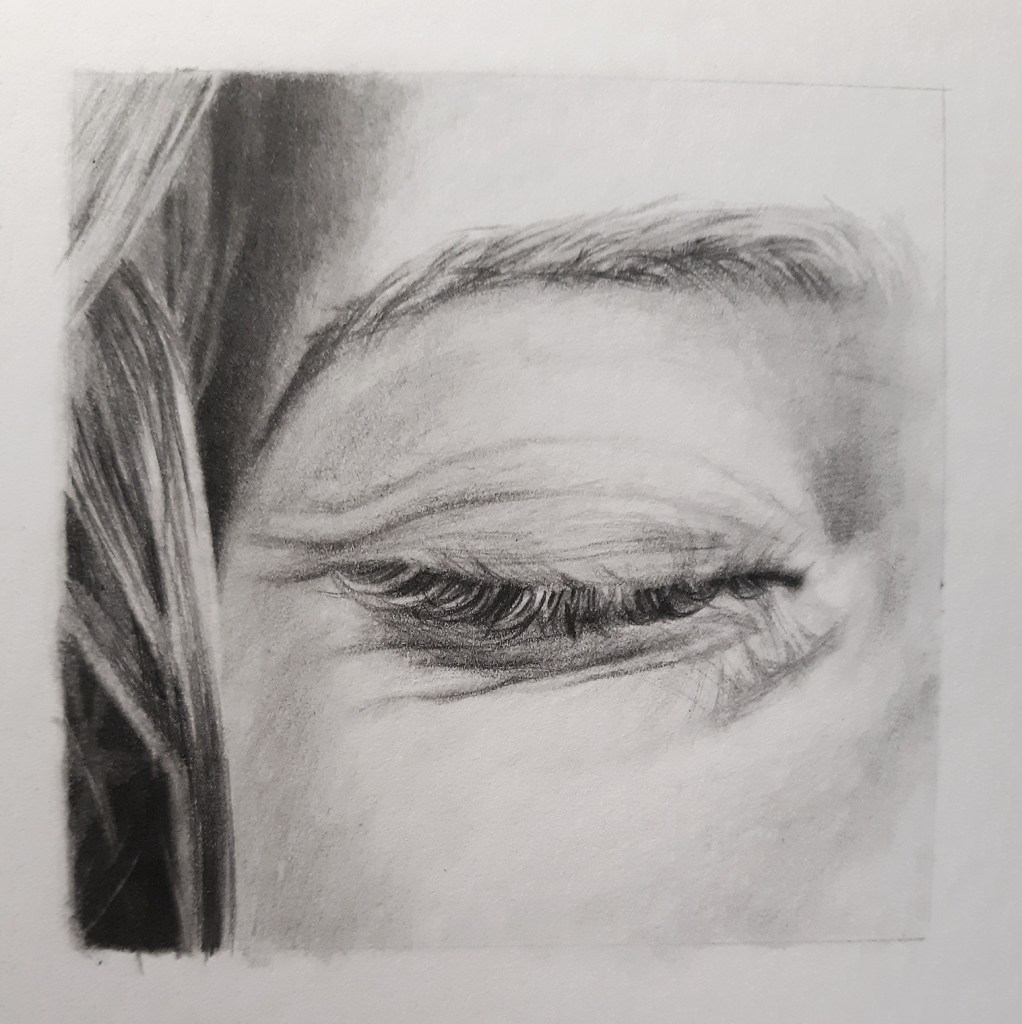
There are a few fly-away hairs in the reference picture, but since I haven’t quite finished the skin, I’ll save those for last to go on top of everything else.

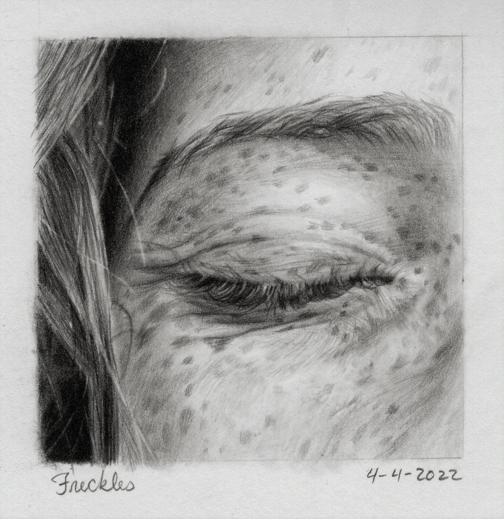
Alright, freckles! I love adding the freckles, because I feel like they give so much personality and individuality to a portrait. They’re not as hard to draw as they look, but they are one of the finishing details, so there’s not a whole lot of room for, “eh, I can fix that later.”
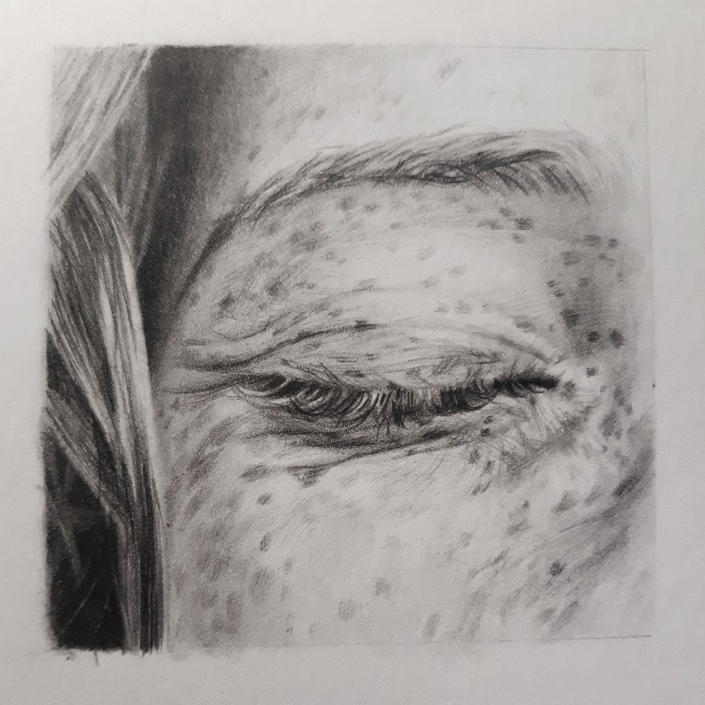
I try to be as accurate as possible. I’m working mostly with my HB pencil here, with an occasional touch of 2B, since the freckles are so light.
I’m trying to follow the direction of the skin as I draw the freckles. They’re not exactly circles, like I used to think they were… So I’m trying to be careful to draw the correct shapes as they move and curve with the shape of the face. And finally I touch over them with a blending stump. I’m not being too vigorous with my blending at this point, since I want some of my pencil strokes to show through and create the texture of the skin.
Finishing touches. I double check my tones, adjusting the skin tone and texture a bit with my pencil, stump, and kneaded eraser. Then I go back and do a bit more layering on the hair, eyelashes and eyebrow; the HB pencil works really well for getting those fine, hard lines. And finally I pull out my electric eraser to lift out the light wisps of hair. I’m not drawing EVERY single wisp that I can see. Just enough to capture the feeling of realism.
And voila! You’re done! Or are you? Don’t try to rush through the end of your drawing. Take your time. Perfect your work. And always remember, in the end, a work of art is never finished, only abandoned.
*bows*
So, I hope you’ve learned something edifying from this post, and you’re ready to pick up your pencils and conquer the world of realistic drawing! In my next post we’ll be discussing a different method of blending graphite, and I am so. excited. Ahhhhhhh!
Okay, I’ll stop screaming.
Go forth and create beautiful things!
~Chalice

Wow. Just wow. Pardon me while I go cry over how intense and beautiful this is.
LikeLiked by 1 person
Umm… thank you… 🥺💛💛💛 *awkwardly hands you a tissue and pats you on the back*
LikeLike
I….LOVE IT! It looks so good! Thank you for all your tips and tricks. I feel like I learn something from you every time. 🙂 ❤
LikeLiked by 1 person
Aw, thanks, Kyndal! That’s really encouraging, and I’m so glad you’ve found this helpful! 😊💛
LikeLike
Freckles!?! I didn’t know you did freckles! I’ve been sketched by some artist friends before but they’ve never gone so far as to bring out the freckles! I’m totally intrigued! I’ve saved your picture to my phone, and it’s in my folder labeled beautiful, and in my favorites! Amazing!
LikeLiked by 1 person
Yes! I love freckles! They’re one of my favorite things to add to a drawing, and I love drawing people with lots of freckles. 😉💛
Aww, thank you, Abigale! I’m so glad you like the drawing.
LikeLike